Customizing Your Widget Appearance and Branding
Last updated: September 29, 2026
The widget is the first thing visitors see of your Marketing Agent, so it should look like it belongs on your site rather than like something bolted on.
Everything that controls its look sits in Customize Widget, the first section of the Widget tab. A live preview on the left updates as you change settings, so you can see the result before you save.
How do you open the widget appearance settings?
- Sign in to app.docketai.com.
- Select Marketing Agent Configuration in the left sidebar.
- Open the agent you want to style.
- Open the Widget tab. Customize Widget is the first section and opens by default.
What is the difference between Classic and Co-browsing mode?
Widget mode is the biggest visual choice you make, and it is easy to miss because the rest of the settings sit below it.
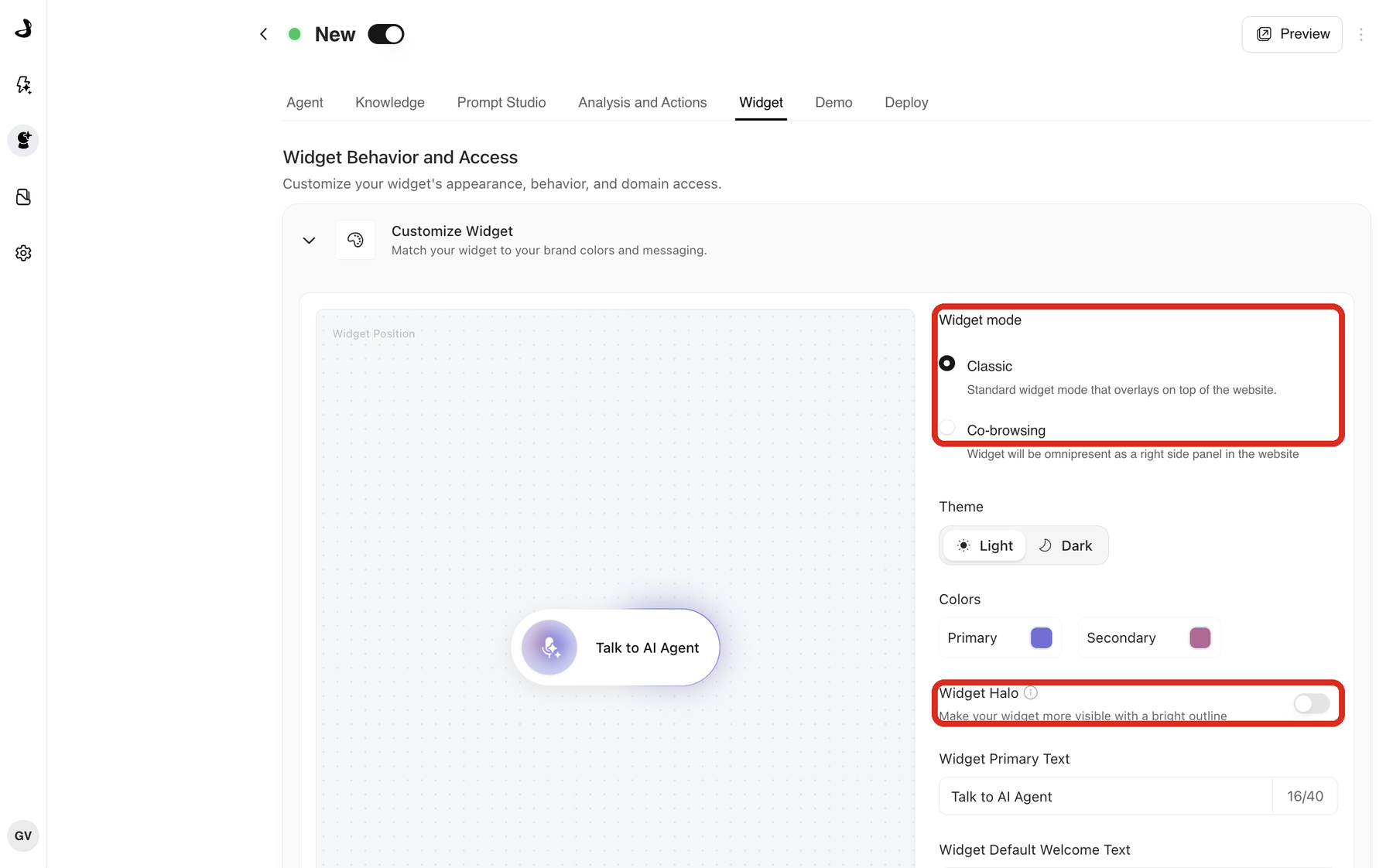
| Classic | Co-browsing | |
|---|---|---|
| Layout | A launcher in a corner that opens into a panel | A panel docked to the right of the page |
| Effect on the page | Opens on top of your content | The page reflows beside it, so nothing is covered |
| Across pages | Opens and closes per page | Stays present as the visitor moves through the site |
| Best for | General coverage on any page | Pages where the agent should stay visible while reading |
Co-browsing is available to every customer and is not limited by plan. It suits pages where visitors read and evaluate, such as FAQ, blog, resource and webinar pages. A homepage is usually better with the Classic launcher.
Two things are worth knowing before you switch a live page to Co-browsing. The panel takes up part of the browser window, so pages with fixed navigation, cookie banners or very long content may need small layout adjustments, and Safari is worth testing specifically. On mobile, Co-browsing falls back to the Classic widget.
Co-browsing is a layout, not screen sharing. The agent does not see, record or control the visitor's screen, and it does not fill in forms or navigate the page for them.
Where does the widget appear on the page?
Widget Position sits under the preview and offers Bottom Left, Bottom Center and Bottom Right. It applies to the Classic launcher.
Pick the position that avoids your existing fixed elements. Cookie banners, live chat launchers and back-to-top buttons are the usual collisions, and they behave differently on mobile, so check both widths on a deployed page.
How do you match the widget to your brand?
Three settings work together. Start with Theme, then adjust colour.
- Theme sets the widget to Light or Dark. Choosing the opposite of your page usually gives the clearest contrast, so a light site often looks best with a dark widget.
- Colors sets a Primary and a Secondary brand colour. Select a swatch to open the picker.
- Widget Halo adds a bright outline around the launcher to make it easier to notice. It is off by default.
What should the widget say?
Two text fields control the wording, and both have a 40 character limit shown by a counter beside the field.
- Widget Primary Text is the label on the launcher, the words a visitor reads before clicking. "Talk to AI Agent", "Ask us anything" or "Get a demo" all work.
- Widget Default Welcome Text is the greeting shown when the widget first appears. Matching it to the page helps, so a pricing page can be more direct than a product page.
Forty characters is a hard cap, so write the label short rather than trimming it later. On the standalone page only the welcome text is shown, because the launcher is not needed there.
Widget sounds turns audio feedback on or off. Many B2B sites turn it off, since visitors are often browsing in an office.
How do you save and check your changes?
- Review the live preview.
- Select Save at the bottom of the Customize Widget section. Discard undoes unsaved changes.
- Reload the Widget tab and confirm the values persisted.
- Open a deployed page on desktop and on mobile.
Each section of the Widget tab saves separately, so saving here does not save changes you made elsewhere on the tab.
The setup is ready when the button text fits, the widget does not cover anything important, and the text stays readable against your chosen colours at both widths.
Can different agents look different?
Yes. Appearance belongs to the agent, so a homepage agent can use your primary brand colour and a broad call to action while a pricing-page agent uses a different accent and a label like "Get pricing help".
Frequently asked questions
Why is my button text cut off?
Widget Primary Text is capped at 40 characters, and long labels can still be tight on narrow screens. Shorten the label and retest at the smallest width you support.
Can I set a different widget position for desktop and mobile?
No. Position is set per agent and applies to every device. If the widget collides with something on mobile only, moving the other element or changing position for both is the practical fix.
Does Co-browsing work on mobile?
On mobile, Co-browsing falls back to the Classic widget. The docked side panel is a desktop layout.
Does Co-browsing follow visitors onto my subdomains?
No. It stays present across the pages of the site it is installed on and does not currently extend to subdomains.
Does switching to Co-browsing change how leads reach my team?
No. Widget mode is a layout choice. Meeting booking and human handoff work the same in both modes.
Why can I not see Co-browsing when I preview the agent?
The standalone preview page always shows the full-page experience. To see the docked panel, deploy the script to a page and open it there.
Is Widget Halo on by default?
No. It is off until you turn it on for that agent.
My saved colours are not showing on my site. What should I check?
Reload the Widget tab to confirm the values saved, then reload your page without cached content. If your site uses a CDN or CMS cache, publish and clear that cache too.